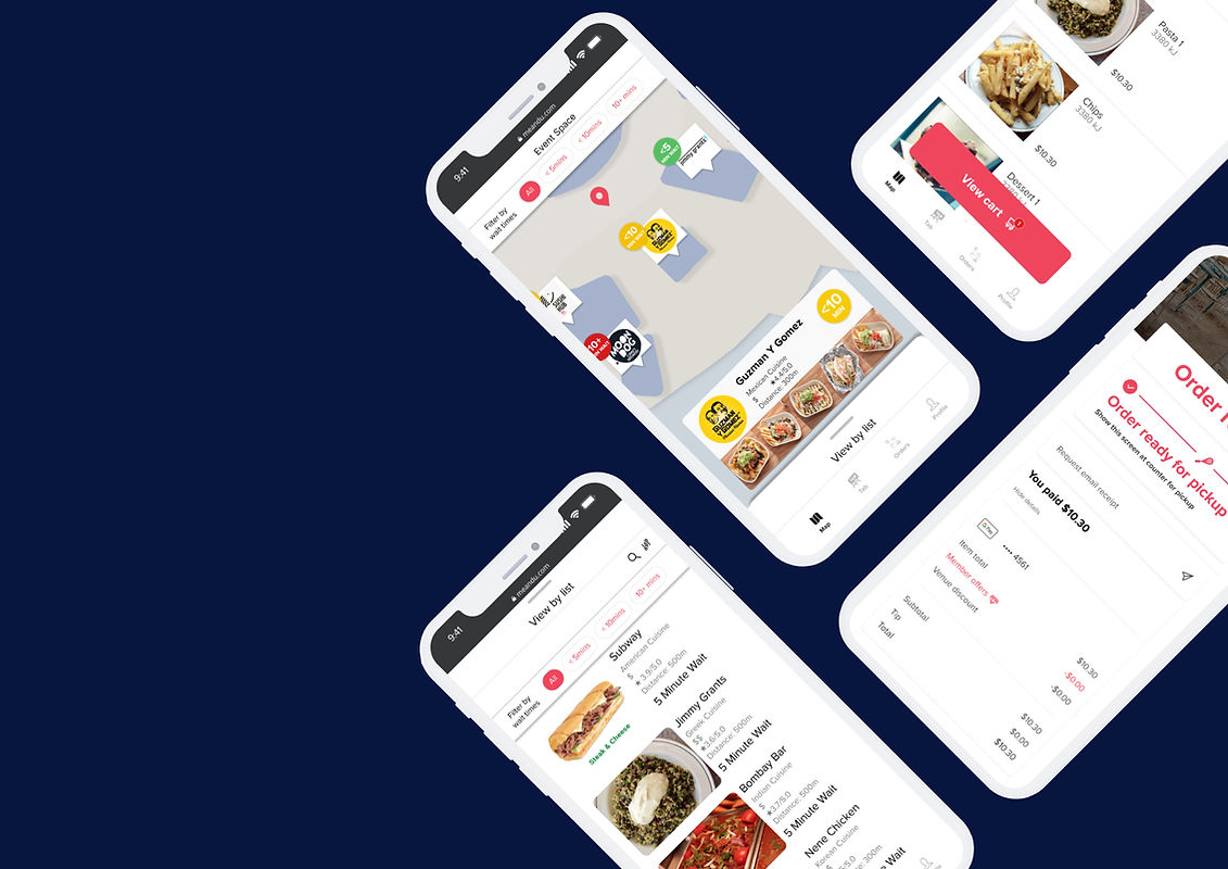
Me&U: Case Study
Helping users make
Me&U is an at-table ordering platform that is used to order & pay for food and drinks in hospitality venues across Australia, New Zealand, the UK and the USA.
Over the 3-week design project,
I was given the opportunity to help Me&U investigate how they could support multiple venues ordering from a single location. Communication with was conducted weekly to balance business needs and user needs in order to develop the final design.
A final design based on the current product was created by understanding the business direction allowing developers to understand directly what the solution is.

Meet the team


Melbourne
Julianna Tong
UX designer
Melbourne
Jason Tam
UX designer
Malaysia
Boon kit Tan
UX designer
Sydney
Peter Zheng
UX designer
The business opportunity
To begin this project we needed to understand what was the business opportunity.
Our research was focused on a variety of venues since we believe that users at all types of venues behave similarly. This allows the product to possibly be implemented at all of these locations.


Market
Stadium
Music festival
Food court
These examples demonstrate the essence of multi-vendor spaces within one site that will trigger users' decision-making behaviour.
Our Research

To understand the behavior of the users, we must examine how Me&U currently works, what the users think about their process, and how they make decisions. Considering Me&U is a current app in a market with many competitors, it is important to do extensive research to provide them with the best solution possible.

User surveys

Contextual inquiry

User interviews

Market analysis
By using these research methods, we analyzed all aspects of the food industry across multiple vendor scenarios and brought them to our UX process at the next stage. Data was collected from multiple locations around the world and interesting insights were gathered.
A dive into the browsing behaviour
User surveys
Our first step was to reach out to a large number of users to understand how they make decisions in regards to multiple vendor sites.
In a global Slack channel, we posted the interview and collected quantitative data from people all over the world.
Following are the percentages generated by receiving 41 surveys.
Surveys were conducted in order to gain an accurate understanding of how people from different backgrounds and locations think and act. Results showed that users primarily prefer to choose one vendor at a time, order through QR codes, see pictures, and are not sure what to eat the majority of the time.

When eating at a food court, where do you get your food from?
Have you ever ordered food through a QR code?
Do you know what you want to eat when you go to a food court?


Do you want to see depiction of your food before ordering?

we still wanted to understand more about how users browse for their food choices
So, we did some user interviews and contextual inquiry and we found
"Users like to browse before selecting what to eat."

We found that users would walk into the food court to view all their options
Users walked into the food court and stopped at a vantage point to view all vendor options before proceeding

Some users were more thorough and would walk the entire perimeter of the food court


Users get a thorough review of all selections by walking the entire perimeter of the the food court before making their decision.

"I'll scan the food court for about 10 seconds before choosing a place to eat"
User 1, Melbourne
"I usually decide on what to eat when I'm at the food court"
User 3, Melbourne
"I typically walk around the food court before making a decision"
User 5, Melbourne
"Users choose vendors based on queue lengths."

Users walk into the food court with the intention to eat from a particular vendor, but will change their minds if the queue is too long.
In these examples we noticed customers headed towards a vendor, saw a long queue and selected another vendor


"I will change my mind if the queue is too long"
User 3, Melbourne
"Long queues makes me reconsider my options"
User 10, Sydney
"I will choose between the options with the shortest queues"
User 4, Melbourne
"Users browse using visual cues."

Users browse the counter before selecting vendor. They often consider the menu and what is presented at the counter.
As proven in our user surveys people are influenced by visuals
In these examples users would go right up to the counter and see what's presented or on the overhead boards before deciding


"I choose what to order based on pictures and descriptions on menus"
User 1, Melbourne
"I like to see what I'm getting before ordering"
User 6, Sydney
"I have made decisions on what to eat after seeing what others around me are eating"
User 4, Melbourne
"Users do not have all the information."
At a contextual inquiry at an event at Rod Laver Arena, we understood that users do not have all the information.
Upon entering the venue there were large amounts of people lining up at the entrance (location 1) and scattered around the first few gates closest to the entrance. As we walked through the arena we saw that the lines started to decrease and when we arrived at the other side of the arena (location 2) we noticed there was only one person there buying food.
There was a clear imbalan ce of queue lengths weighted towards the main entry


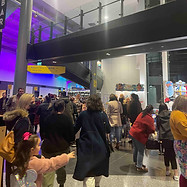
We checked both before the event and halfway through the event and noticed that although there was a slight change in both instances, the imbalance is still there.
We suspected that it is because people will go for food where they know there is a vendor and avoid trying their luck at further vendors as they are unsure what the waiting time is like
These numbers below represent the number of people in the queue during:
Before the event

Halftime


"At the Aus Open, I go to the vendor that is furthest away from the main area because I know it has the shortest queue."
User 12, Melbourne
"I just accept there will be a line at the AFL so I go get food at the place closest to my seat."
User 8, Melbourne
"There are always long lines at the AFL"
User 4, Melbourne
"Users do not want to miss out on the event."
Market research
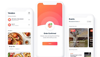
Our research included looking at what is currently available in stadiums. In MLB stadiums in the USA, you can order food and pay using their app and have it delivered directly to your seat, or pick-up from the counter. Snackr operates in the same way in Australia.

MLB Stadiums
-
Order and pay at your seat via app.
-
Food will be delivered to your section.
-
Food is passed on via the crowd to your location.
Snackr
-
Order and pay at your seat via app.
-
Food will be delivered to your seat or via counter pick-up'.
-
Delivery may not be available to those seated away from the aisles.
Both of those examples tackle the user pain points of missing out on events and having to queue for food.
This was evident in our user interviews and we found that people compromised on the food for the sake of not missing out on the game.
We noticed that this goes beyond sports games. This behaviour applies to all the venues we looked into.

"I like to eat beforehand because I don't want to risk missing any part of the game."
User 12, Melbourne
"I suss out where the closest food vendor is before taking my seat so I can rush over during the break"
User 8, Melbourne
"I'll eat at the food court because it is quick and I want to get back to shopping"
User 4, Melbourne
So who are we designing for?

Now that we have a set of qualitative and quantitative data, what do we do with it? How do we synthesise our research?
UX methods were used to define our research and understand the core problem behind our users' problems.

Affinity mapping

Archetype

Problem statement

Journey mapping
With these methods, we are able to condense our research, helping us concentrate on and visualise the most important aspects of our findings. As a result, we were able to define our problem and begin ideation.
Affinity Mapping
According to the insights, it was all about wait times, the ordering process, and what the user actually values on a good night out. Before making an order, users want to see their options and will change their minds when they see long queues. At an event, they would prefer to save time over food.
Our assumptions were challenged because users wanted more clarity on waiting times , but in reality users seem to just want shorter queues and value the event more than anything else.

Meet our

The archetypes want to spend as much time as possible at the event.
Their evening will be more enjoyable if they do not have to stand in line for food or worry about the time until the show starts.
Why an archetype?
In this study, we wanted to examine the behaviour of all users at multi-vendor locations, regardless of their age, income, or gender. An experience priority isn't a 30-year-old man or a 12-year-old girl, it's every person who wants to enjoy any event. The archetype of our audience is someone who just wants to enjoy an event as much as possible.
In the end, it's all about prioritising the experience they paid for.

"The Experience Prioritiser needs to make efficient food choices so that they can maximise their experience."

The problem statement:
Our archetypes

The Experience prioritisers' journey is one in which they are excited about the event, want food, and do not want to miss anything. Eventually, they miss out on a few minutes and are frustrated that they made that decision. In all our research, we found the following core insights that are the problem we are attempting to solve and the target audience we are trying to reach. It is from here that we can create the problem statement.
How do we solve the problem?

Once we've identified our archetype, we can create a possible solution.
To achieve this, we followed a classic google design sprint method.

How might we

Crazy 8's

Defining the idea

Feature prioritisation
In the end of this process, we came up with multiple ideas that we wanted to develop, and after discussing and understanding each idea fully, we found the minimum viable product.


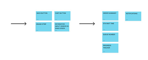
1 / How Might We
According to our understanding of the problem statement, we discussed ideas and potential solutions during our first step of ideation.
From this we created our first set of how might we statements. Together, we voted on how we thought the issue should be resolved.
2 / Crazy 8s & voting
For each HMW, we generated a round of Crazy 8s. Our team sketched out eight possible answers to each question. The team members then voted on the 3 top most compelling solutions. Using these ideas, we were able to create a more detailed concept.
The features included an interactive map, a set time slot for food, a time remaining and position in queue countdown. We were able to move to a more defined design as a result of this process.
3 / Solution sketches & assumptions
Each of us then created our own solution sketches and presented them to the team, from there we developed assumptions and questions for a final sketch design.
This process was used because it cleared up a lot of problems that could occur during user interaction. What are the users choosing based on? How will the users access the QR codes?
4 / Final sketches & dot vote
The team then reviewed our final designs. Our team voted on the features we believe are essential for making this idea a reality.
The exercise was very interesting as we got to see how each of our designs could merge together to create a better and more usable design.
5 / Feature prioritisation
Combining the features creates an interactive map that shows the users live wait times for each vendor, which helps them make more efficient decisions. This idea was chosen because we wanted to maintain familiarity with previous navigation systems while innovating and creating something useful and easy to understand for Me&U.
Our minimum viable product:
Real-time interactive map that allows users to make efficient choices so that they can maximise their experience.
Based on Me&U's current task flow, we integrated our additional feature in order to create a user flow to better understand the user's decision. The purpose of this UX process is to understand how users may experience the MVP feature. Users can filter the options and select vendors to see more information in the "view map in full screen" task of the user flow.
Our efficient solution for you.
We know we are designing for someone that wants to prioritise experiences at events.

At events, the primary experience is the event and food is not the priority.
They are their food experience, they are there to spend time with friends and family and enjoy the show.

Well, this is what the solution looks like. Here, we see our user enjoying themselves at an event. Everything is going well but they are getting hungry
At first they are worried about how long it will take - but wait! They remember that me&u QR code at the event
One quick scan later, and they are impressed. They can see where they are with the handy map and all of the food options right in the palm of their hands!

But that's not all, the wait times for each vendor are also displayed & colour coded.
They are able to quickly browse all the vendors and see the most popular dishes

Our user makes their decision and checks out. Then they turn their attention back to the event and a while later receive a notification to pickup their food.

They already know how far the vendor is and quickly go to pick up and get back to the event.
Now eating the delicious food, it's like they never left. #bestdayever

Testing the of the product
During all stages of our testing, we wanted to demonstrate that this product worked, and we iterated many times to ensure that our focus was on the usability of our product.

Paper prototype

-
"Logos allowed a quick look to understand whats offered."
-
"The idea of using colours to help navigate was great."
-
"Looked familiar to other apps so it was easy to use."


-
"Colours were not suitable for accessibility issues."
-
"Comparing colour to time was annoying."
-
"Tried to navigate a pathway but was unable to."
Lo-fi Prototype

-
"Time shown on the map page was easy to understand."
-
"Description of price and location after selecting was nice."
-
"ETA gave me confidence in the checkout process."


-
"Colour choices were a bit weird I had to keep referring to the legend."
-
"Map was overwhelming with information."
-
"View cart button could not be found."
Mid-fi prototype
-
"Logos allowed a quick look to understand whats offered."
-
"The idea of using colours to help navigate was great."
-
"Looked familiar to other apps so it was easy to use."


-
"Colours were not suitable for accessibility issues."
-
"Comparing colour to time was annoying."
-
"Tried to navigate a pathway but was unable to."
Browsing behaviour still
In our research, we found that users wanted to see the options and browse for food choices that suited their needs, as shown through many iterations. Often, users are looking for quick information about a vendor before moving on, so they click on options to see what's available.
Our users noted many times throughout the research and testing that they make decisions based on what they see

Our Information. deck
As we iterated, we always sought to improve the efficiency of providing instant information to our users. According to our research, users wanted to be able to see what they were ordering, and what they saw really influenced their decisions.
We wanted to digitalize that experience for our users and let them see the food. An information deck is what we like to call it, something that gives users a quick glimpse of what a vendor has to offer, just like a bain arie!


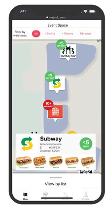

to our users
Our focus during the numerous iterations was on the visibility of the data and how quick a user could understand the information. We listened to the users throughout the journey and addressed their feedback.
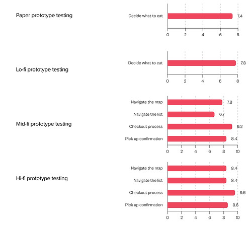
How our users about each stage of testing
We recorded qualitative as well as quantitative data throughout each stage, we asked our users how confident they felt about each stage of the prototype and a positive trend occurred as we designed and iterated our product, showing the product's success.
Bringing it back to the problem statement:
"The Experience Prioritiser needs to make efficient food choices so that they can maximise their experience."
Our Solution
Helping users enjoy their experience
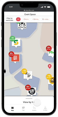
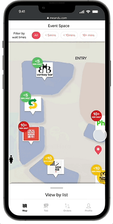
This is our final solution, a map ordering system that allows users to make the most efficient choice for them and not miss out on the event that they are attending

-
Scan QR
-
Accept privacy policy
-
Accept counter pickup only
-
Choose via view by list
-
Browse for food item
-
Add to cart

-
Choose vendor via map
-
Browse through infromation card
-
Browse for food item
-
Add to cart

-
View cart
-
Add personal details
-
Add payment
-
Review order
-
Order summary

-
Notification received for pickup
-
Payment summary page
-
Pick up


Helping users make efficient choices


Scan options
Browse vendors
Make efficient decisions easily
Users can scan all options with a single swipe by allowing them to pan efficiently
With our traffic light filtering system, users can stop, think about it, and then go once they are ready.
Users will be able to browse items effectively by switching between vendors in the information deck.
How this might look at all types of events

Festival

Arena

Food court
We considered how this may work in other venues therefore showcased examples to our clients to suit their business needs. This is because our idea is adaptable to any situation and we want to prove that it can work in a real life scenario
Main takeaways

A snapshot of our client meeting


Working with stakeholders:
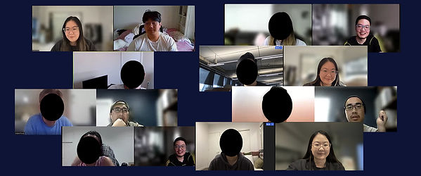
I enjoyed working with Me&U very much. I enjoyed seeing what it was like to work with a UX team and professionals in an established tech company. Me&U kindly provided us with many of their design assets, which helped us understand and learn more about Figma. Our teamwork was exceptional on this project, we stuck to a 3-week schedule that was planned from day one and met all our daily goals.
Teamwork:
I have learned that understanding and inviting opinions are very important in teamwork. In addition, letting everyone try each UX design process allowed us to develop ideas we had not considered previously. Our team was very big on communication and ensured we did daily standups every day which helped us stay in the same direction during the day.
If we had more time:
During our research, many of our users went to events with friends and were very social, so if we had more time we would explore Me&U's group tab system. We informed the stakeholders about this and they said that it would be interesting to see how that could be adapted to our design. To further develop this project, we could focus on this second goal.
Summary:
In summary, this was a very awesome project. I learned a lot and was able to take on each of the UX steps to create an application that is not only used and understood by users, but also aligns with the business needs of ease of implementation.
